
Castle Rock’s distinctive geological character creates one of Colorado’s most visually striking residential environments, where dramatic sandstone formations, red rock outcroppings, and golden prairie grasslands form natural backdrops that profoundly influence successful exterior paint selection. Unlike communities built on uniform terrain, Castle Rock homes exist within a landscape palette that shifts from warm golden browns and rich terra cottas to cool grays and sage greens, depending on seasonal conditions, time of day, and viewing perspective. Understanding how to harmonize paint colors with this dynamic natural stone environment requires recognizing that your home’s exterior colors either enhance or compete with one of Colorado’s most beautiful geological settings.
The challenge facing Castle Rock homeowners involves creating exterior color schemes that feel integrated with rather than imposed upon the natural landscape. The area’s signature Dawson Formation sandstone, with its characteristic buff, brown, and reddish hues, creates a warm foundation palette that certain paint colors enhance while others appear jarring and out of place. Successful color selection requires understanding not just which colors look attractive in isolation, but which colors create visual harmony with the specific stone formations, native vegetation, and seasonal color changes that define Castle Rock’s unique character.
Understanding Castle Rock’s Natural Color Palette
The geological foundation of Castle Rock provides a sophisticated natural color palette that shifts subtly throughout the day and dramatically across seasons. The Dawson Formation sandstone that gives the town its name displays complex color variations that include warm golden browns, rich terra cottas, subtle grays, and occasional touches of deep red. These stone colors appear differently under various lighting conditions, with early morning and late afternoon light emphasizing warm tones while midday sun brings out cooler undertones and subtle gray variations.
Native vegetation adds seasonal color dynamics that successful paint selection must accommodate. Spring brings fresh green growth that contrasts beautifully with warm stone tones, while summer’s golden grasses create monochromatic harmony with buff-colored rock formations. Fall introduces burgundy and orange accents through changing scrub oak and cottonwood foliage, while winter’s muted palette emphasizes the stone’s gray undertones and creates stark contrasts with evergreen vegetation.
Understanding these natural color relationships provides the foundation for paint selection that feels authentic to Castle Rock’s environment. Colors that echo or complement these natural tones create homes that appear to emerge organically from the landscape, while colors that ignore or compete with natural elements often appear artificial and out of place. The goal involves creating exterior color schemes that enhance rather than dominate the natural beauty that defines Castle Rock’s residential appeal.
The key lies in recognizing that Castle Rock’s landscape palette is both complex and subtle, requiring paint colors with similar complexity rather than flat, single-note hues. The natural stone displays multiple undertones that shift with lighting conditions, suggesting that successful paint colors should possess similar depth and variation rather than appearing monotonous or overly simplified.
Harmonizing with Sandstone and Red Rock Formations
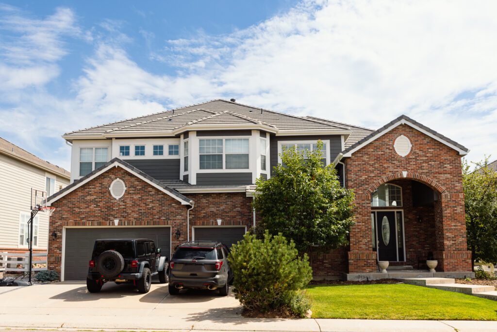
Castle Rock’s signature sandstone formations provide perhaps the most important color reference for exterior paint selection because these geological features form the visual anchor for the entire community. The warm, earthy tones of local sandstone—ranging from pale buff to rich golden brown—create a foundation palette that works beautifully with paint colors that share similar warmth and complexity.
Successful sandstone-inspired paint schemes often draw from the stone’s natural color variations rather than attempting to match specific tones exactly. Warm beiges and taupes that echo the stone’s lighter variations create sophisticated neutrals that feel indigenous to the area while providing clean, contemporary backgrounds for architectural details. Deeper brown tones that reference the stone’s richer areas work particularly well as accent colors for trim, shutters, or architectural features that benefit from visual emphasis.
The red rock formations scattered throughout Castle Rock add another layer of color complexity that thoughtful paint selection can either complement or clash against. These iron-rich stone formations display colors ranging from subtle rust to vibrant terra cotta, creating natural accent colors that can inspire beautiful paint combinations when handled skillfully. Paint colors that pick up these red undertones—warm grays with slight pink influences, sage greens that create natural color harmony, or muted golds that bridge warm stone and vegetation—create sophisticated color relationships that feel authentically connected to the local environment.
Understanding how different paint colors interact with these stone formations throughout the day becomes crucial for successful color selection. Colors that complement the stone in morning light may appear different at midday or during the golden hour before sunset. Testing paint samples against actual stone references during various lighting conditions helps ensure color choices that remain harmonious throughout daily light cycles rather than looking perfect only during specific times.
Complementing Prairie and Mountain Views
Castle Rock’s unique position between the Colorado prairie and the Front Range mountains creates distinctive view corridors that significantly influence successful paint color selection. Homes with eastern exposures often overlook rolling prairie grasslands that shift from spring green to summer gold to winter brown, requiring paint colors that complement these changing seasonal palettes while maintaining year-round appeal.
Prairie-facing homes achieve beautiful integration with landscape views through paint colors that echo native grassland tones without competing for visual attention. Warm neutrals like cream, pale gold, and soft tan create backgrounds that allow natural views to dominate while providing sophisticated color foundations for architectural details. These colors work particularly well when combined with deeper accent tones that reference local stone formations, creating layered color schemes that feel rooted in place rather than arbitrarily chosen.
Mountain-facing exposures present different color opportunities because the Front Range provides a dramatic backdrop of changing colors that shift from blue-gray distance views to rich green foothills to snow-covered peaks depending on season and weather conditions. Paint colors that complement mountain views often benefit from slightly cooler undertones that harmonize with distant blue-gray mountain colors while maintaining enough warmth to feel welcoming and residential.
Sage greens work particularly well for mountain-facing homes because they echo both the natural vegetation found in foothills environments and the blue-green color relationships that create visual harmony with distant mountain views. These colors provide sophisticated alternatives to standard suburban paint palettes while creating authentic connections to Colorado’s distinctive landscape character.
The key to successful view-oriented color selection involves understanding that your home’s paint colors will be seen against these natural backdrops by both residents and visitors, making it essential that color choices enhance rather than compete with the spectacular natural views that define Castle Rock’s residential appeal.
Working with Natural Stone Architectural Elements
Many Castle Rock homes incorporate natural stone elements directly into their architectural design, creating unique color selection challenges and opportunities. Stone foundations, accent walls, chimneys, and architectural details provide permanent color elements that new paint must accommodate, often determining rather than following overall color schemes.
Local sandstone used in residential construction typically displays the same warm, complex color variations found in natural formations, providing excellent starting points for coordinated paint selection. Homes with sandstone foundations achieve beautiful integration when paint colors pick up undertones found within the stone rather than attempting to match dominant colors exactly. This approach creates sophisticated color relationships that feel intentional and harmonious rather than accidental or arbitrary.
Stone accent walls or architectural features often work best when paint colors provide either gentle contrast or subtle harmony rather than dramatic opposition. Paint colors slightly lighter than the stone’s dominant tones create clean, fresh appearances that highlight architectural details without overwhelming them. Conversely, paint colors slightly deeper than stone tones can create rich, grounded appearances that emphasize the natural material’s beauty while providing sophisticated backdrops for landscaping and seasonal decorations.
Understanding the difference between complementary and matching color approaches becomes crucial when working with natural stone elements. Attempting to match stone colors exactly often results in muddy, lifeless paint selections that fail to complement the stone’s natural beauty. Instead, choosing paint colors that share undertones or color families with stone elements while maintaining distinct visual identities creates dynamic color relationships that enhance both materials.
The goal involves creating color schemes where paint and stone elements support each other visually while maintaining their individual characteristics, much like successful color combinations in nature where different elements share harmonious relationships without losing their distinct identities.
Seasonal Color Considerations
Castle Rock’s dramatic seasonal changes significantly affect how exterior paint colors appear throughout the year, requiring color selections that remain attractive and appropriate across all seasons rather than looking perfect only during specific times. Spring’s fresh green landscape creates beautiful contrasts with warm paint colors, while summer’s golden grasslands provide monochromatic harmony with earth-toned color schemes.
Fall brings perhaps the most dramatic seasonal color changes, as native vegetation transforms into rich burgundies, oranges, and golds that can either enhance or clash with exterior paint colors depending on color selection wisdom. Paint colors that accommodate these seasonal changes—warm neutrals, muted earth tones, or sophisticated grays with warm undertones—provide stable backdrops that allow seasonal color changes to create natural accent effects rather than overwhelming the overall color scheme.
Winter considerations become particularly important in Castle Rock because snow coverage dramatically alters color relationships and emphasizes whatever paint colors remain visible. Colors that appear sophisticated against summer’s golden landscape may look harsh or inappropriate against winter’s stark contrasts, requiring paint selections that perform well under both conditions.
Understanding how Colorado’s intense sunlight affects paint colors throughout the year also influences successful color selection. The high-altitude UV exposure that characterizes Front Range communities can cause certain colors to fade unevenly or shift in appearance over time, making it essential to choose paint formulations and colors specifically designed for high-altitude, high-UV environments.
Architecture-Specific Color Strategies
Castle Rock’s diverse architectural styles require different approaches to landscape-coordinated color selection because each style relates differently to natural surroundings. Ranch-style homes, with their horizontal emphasis and closer connection to ground level, often achieve beautiful landscape integration through color schemes that echo prairie and grassland tones while maintaining enough sophistication for contemporary living.
Contemporary and modern architectural styles in Castle Rock benefit from color approaches that acknowledge the natural environment without attempting to mimic it directly. Clean, sophisticated neutrals that share undertones with local stone formations create contemporary expressions that feel connected to place while maintaining the crisp, uncluttered aesthetic that defines modern design. These approaches often involve using natural stone colors as inspiration for simplified, refined paint palettes rather than complex color matching.
Traditional architectural styles like Colonial or Victorian homes transplanted to Castle Rock’s environment require careful color selection that honors both architectural heritage and landscape context. This often involves adapting period-appropriate color palettes to include warmer, earth-toned versions that complement local stone and vegetation while maintaining the historical character that defines these architectural styles.
Mountain contemporary and rustic architectural styles naturally align with Castle Rock’s landscape character, often incorporating natural stone and wood elements that provide color direction for paint selection. These styles typically achieve best results with paint colors that defer to natural materials while providing clean, contemporary backgrounds that enhance rather than compete with architectural features.
Coordinating with Landscape Design
Successful exterior paint selection in Castle Rock requires considering not just natural landscape elements but also designed landscape features that homeowners add to their properties. Xeriscaping, increasingly popular in Colorado’s semi-arid environment, often incorporates gravel, decorative stone, and drought-resistant plants that create additional color elements affecting overall property appearance.
Native plant landscaping that emphasizes indigenous Colorado species provides excellent color guidance for paint selection because these plants naturally harmonize with local geological elements. Sage brush, buffalo grass, blue grama, and native wildflowers create seasonal color palettes that change throughout the year while maintaining consistent relationships with local stone formations.
Designed landscape elements like retaining walls, patios, and walkways often use materials that either complement or contrast with natural stone elements, requiring paint colors that coordinate with these hardscape additions while maintaining harmony with natural surroundings. Understanding how different landscape materials interact with various paint colors helps create cohesive property appearances where all elements work together rather than competing for attention.
Water features, increasingly common in Castle Rock landscaping, add reflective elements that can dramatically affect how paint colors appear under various lighting conditions. Paint colors that look sophisticated under normal lighting may appear different when reflected in water features or viewed against the moving water backgrounds that fountains and streams provide.
Professional Color Selection Process
Developing successful paint color schemes for Castle Rock’s unique environment benefits significantly from systematic approaches that consider all relevant factors rather than making color decisions based on personal preferences alone. Professional color selection processes typically begin with comprehensive site analysis that includes documenting existing stone elements, identifying primary view corridors, and understanding how natural lighting affects the property throughout the day.
Successful color selection also requires understanding the relationship between different paint finishes and natural stone elements. Satin and semi-gloss finishes reflect more light and can either enhance or compete with natural stone textures depending on application and color selection. Flat and eggshell finishes often provide better harmony with natural stone elements because they create less reflective contrast while still providing adequate protection for Colorado’s challenging climate.
Testing color combinations under actual site conditions becomes crucial because paint colors can appear dramatically different when viewed against natural stone backgrounds compared to standard color cards or digital representations. Creating large sample areas and observing them during various lighting conditions and seasons ensures color selections that perform well under real-world conditions rather than looking perfect only under ideal circumstances.
Professional color consultation becomes particularly valuable for Castle Rock properties because the interplay between natural stone elements, mountain and prairie views, seasonal color changes, and architectural considerations creates complex decision-making scenarios that benefit from experienced guidance.
Long-Term Color Performance
Castle Rock’s high-altitude environment creates specific challenges for paint longevity that influence both color selection and paint product choices. The intense UV exposure, dramatic temperature fluctuations, and low humidity levels that characterize Front Range climates can cause certain colors to fade unevenly or shift in appearance over time, making it essential to choose both colors and paint formulations designed for these challenging conditions.
Lighter colors generally maintain their appearance longer under high-UV conditions, but very light colors may appear washed out against Castle Rock’s warm stone backgrounds. Finding the optimal balance between color intensity that provides visual interest and color stability that maintains appearance over time requires understanding how different paint formulations perform under local conditions.
Color selection that prioritizes long-term performance often involves choosing slightly deeper or more complex colors than might seem necessary initially, anticipating some color shift over time while ensuring that faded colors remain attractive and appropriate to the natural environment. This approach helps maintain property appearance and value while reducing the frequency of repainting cycles.
Creating Timeless Appeal
The ultimate goal of landscape-coordinated paint selection in Castle Rock involves creating exterior color schemes that feel both contemporary and timeless, honoring the area’s distinctive natural character while supporting property values through sophisticated, appropriate color choices. Successful color schemes enhance rather than distract from the natural beauty that makes Castle Rock such a desirable residential location.
This balance requires understanding that trendy color choices may look dated quickly while colors that draw inspiration from permanent natural elements tend to maintain appeal over longer periods. Working with the landscape rather than against it creates exterior appearances that age gracefully while continuing to complement the unchanging natural elements that define Castle Rock’s character.
When you’re ready to create exterior paint colors that celebrate Castle Rock’s distinctive natural stone landscape while enhancing your home’s architectural character and long-term value, contact Right Touch Painting. Our extensive experience with Front Range properties and deep understanding of how color selection impacts both immediate appeal and lasting performance ensures your exterior painting project creates beautiful harmony between your home and Castle Rock’s spectacular natural environment. Let us help you develop paint colors that honor the landscape while expressing your personal style, creating exterior beauty that feels authentically connected to this remarkable Colorado community.